Test post 1
Rarely do branding agencies win awards before they open their doors. But that’s exactly what’s happened with recently launched L.A. creative agency Ad Victorem — and not just once, but twice.
3 min read • April 24, 2019Test post 1
Rarely do branding agencies win awards before they open their doors. But that’s exactly what’s happened with recently launched L.A. creative agency Ad Victorem — and not just once, but twice.

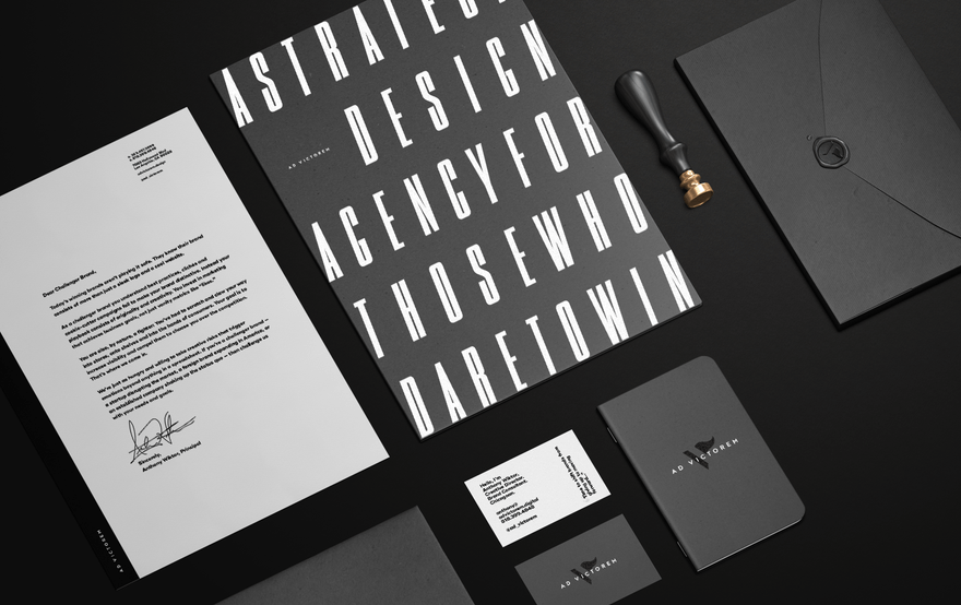
Both awards — a Muse Gold and a HOW Design Award — honor the agency’s very own brand identity which includes its logo – a combination of the V for Victorem (Latin for “Victory”) and a waving flag to create the symbol. The logo also gets animated on the agency’s interactive website. As an added honor, in landing the awards, Ad Victorem beat out much larger and established agencies.
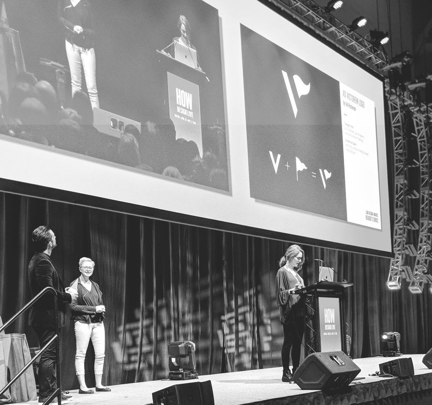
Creative Director Anthony Wiktor accepting the Reader’s Choice Award at the 9th Annual HOW Logo Design Awards
While the awards are firsts for Ad Victorem, they are now part of a large and growing collection for Founder and Creative Director Anthony Wiktor. The 14-year marketing veteran has been featured in Web Designer Magazine’s “Hot 100” twice, and he recently won a Webby Award for designing the website of the Motiv fitness tracker ring.
Based in Hollywood, Ad Victorem officially launched in late 2017 — months after the awards-show submissions — to bring a competitive edge to client branding. Under the motto, “For Those Who Dare To Win,” the agency creates brand identities and digital campaigns with the goal of helping clients “stand out from the crowd and dominate the competition.”
Businesses and brands today are in a constant battle with the competition, the market, etc.,
Ad Victorem’s first clients include Hannah Eden Fitness — “run by a true competitor,” says Wiktor — and Los Angeles’ newest sports team LAFC (as part of a collaboration with their PR agency).

Both the logo and agency were inspired by Wiktor’s love of sports and his last name (“Wiktor” is the Polish variation of “Victor”).
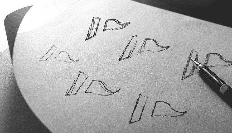
“I simply started drawing dozens of flags, at first thinking it would be a standalone symbol, but then as I started combining letters that could form the flag, similar to the Corvette symbol, everything just came together, and it went from a quick sketch to flushing it out in Illustrator. When I revealed it to the rest of the team, everyone loved it. It was instantly recognizable and, most of all, it fit the narrative we crafted from the name and the foundation of principles from which we created the agency.”
So if you need a logo or a brand identity that helps you stand out from the competition → drop us a line.